Creating an Impression with Colour Strategy
Project: GD Goenka Public School, Rudrapur
In the early months of 2020, the seemingly unstoppable wave of urban migration came to a stuttering halt. As overcrowded city centres became hotbeds of disease and subsequent economic dysfunction, many were prompted to move out of metro cities.
This shift to smaller urban centres and rural settings, while disconcerting in its initial stages, has proven to be a boon for equitable development of infrastructure. As developers and conglomerates seek opportunities in the country’s Tier 2 & Tier 3 cities, architects from India are faced with the challenge of balancing resource efficiency and functionality with the imageability of a project.
The design of GD Goenka Public School in Rudrapur, Uttarakhand, contends with these exact challenges. The city of Rudrapur is the 5th largest in the state of Uttarakhand, climbing up the roster for the total population as well as urban development metrics like literacy and employment rates. As a result, there has been an uptick in the number of schools and colleges being opened in the city. GDGPS Rudrapur has been designed to stand out among this new crop of institutions while adhering to the high standard of educational excellence set by the GD Goenka Group.
The architecture of GDGPS Rudrapur relies on a combination of spatial and aesthetic interventions to achieve this distinction, primary amongst them being the strategic use of colour:
Zonal Demarcation
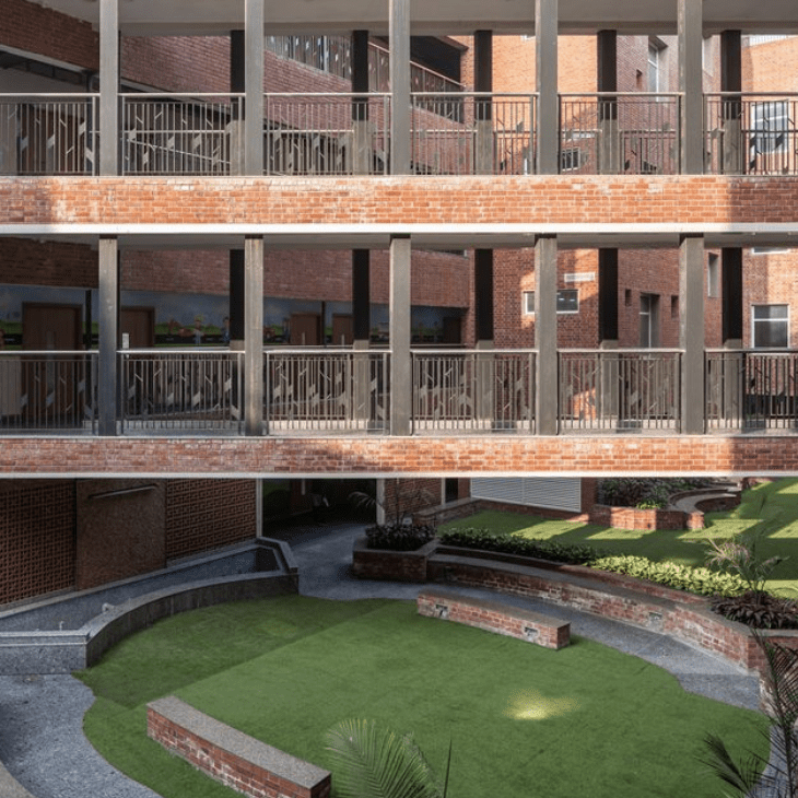
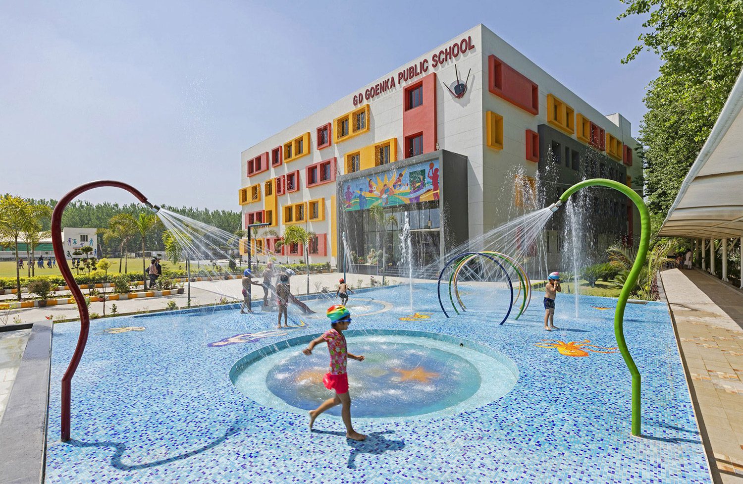
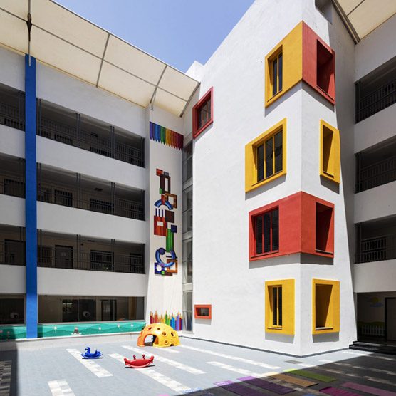
Three parallel courts form the fulcrum of the school’s spatial layout. Two of these courts have been enclosed by built space to form the junior and senior Academic Wings, respectively. The third court forms the Open Air Theatre at the centre of the building, connecting the two wings.
The OAT, which has been designed as the social core of the campus, is characterized by an earthy pink tone.
The colour scheme of each of these blocks corresponds to their role within the spatial hierarchy. The G+3 Academic Wings are imposing structures swathed in white; the OAT, which has been designed as the social core of the campus, is characterised by an earthy pink tone. A colourful mosaic tile trim accentuates the Kota stone steps of the OAT, suiting its dual purpose as a gathering space when not being used for assemblies.
Visual Engagement
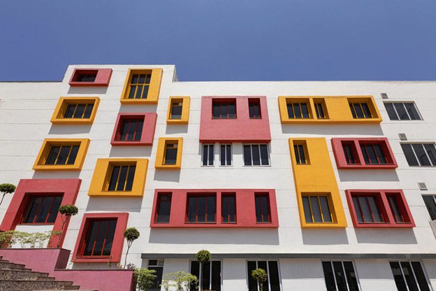
The façade of the building is characterised by concrete sun-breakers in vivid shades of coral and chrome yellow. Presenting a strong contrast to the white mass of the building, these sun-breakers resemble building blocks – their size, colour and asymmetric arrangement evoking a sense of whimsy.
This colour scheme has been followed in the school interiors as well; wall accents and laminates in warm and vibrant colours complement the muted wooden furniture, all placed against a white backdrop.
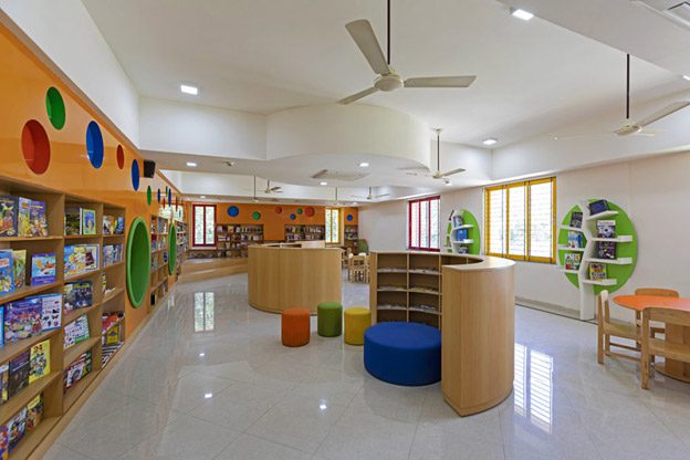
The whimsical colour scheme of the building facade has been utilised in the interiors as well.
The institutional building is separated from the campus entrance by sprawling lawns. In doing so, the visual scale of the building becomes less imposing, and the complex appears more spacious than a 2.75-acre spread would typically allow. The sun-breakers, designed as low-relief cuboidal projections, bring down the scale of the structure even more; the result is a built mass that appears warm and welcoming to users of all ages.
Climate Response
Despite its vicinity to the Terai, Rudrapur experiences high temperatures for most of the year. The colour scheme of the project contributes towards the cooling strategy put in place to maintain a cool indoor climate.
Primary among them is the predominant use of white on the campus. All buildings on site have been painted white, to reflect most of the incident sunshine and reduce heat absorption. White terrace tiles over brickbat coba provide added insulation at the roof level. The colourful sun-breakers further cut down direct glare. These interventions help create an indoor environment that responds to climatic fluctuations with ease.
Presenting a strong contrast to the white mass of the building, the chrome and coral sun-breakers at GD Goenka School resemble building blocks.
Surrounded by green fields and articulated by colourful frames, the white mass of the institutional building is softened; the distinct appearance of the school complex renders it approachable yet memorable, meeting the goals of the client as well as capturing the imagination of its students. The design of GDGPS Rudrapur enhances a climate-responsive spatial layout with visually appealing building elements to create an engaging and sustainable learning environment. In doing so, it leverages colour as the prime tool for image-making.